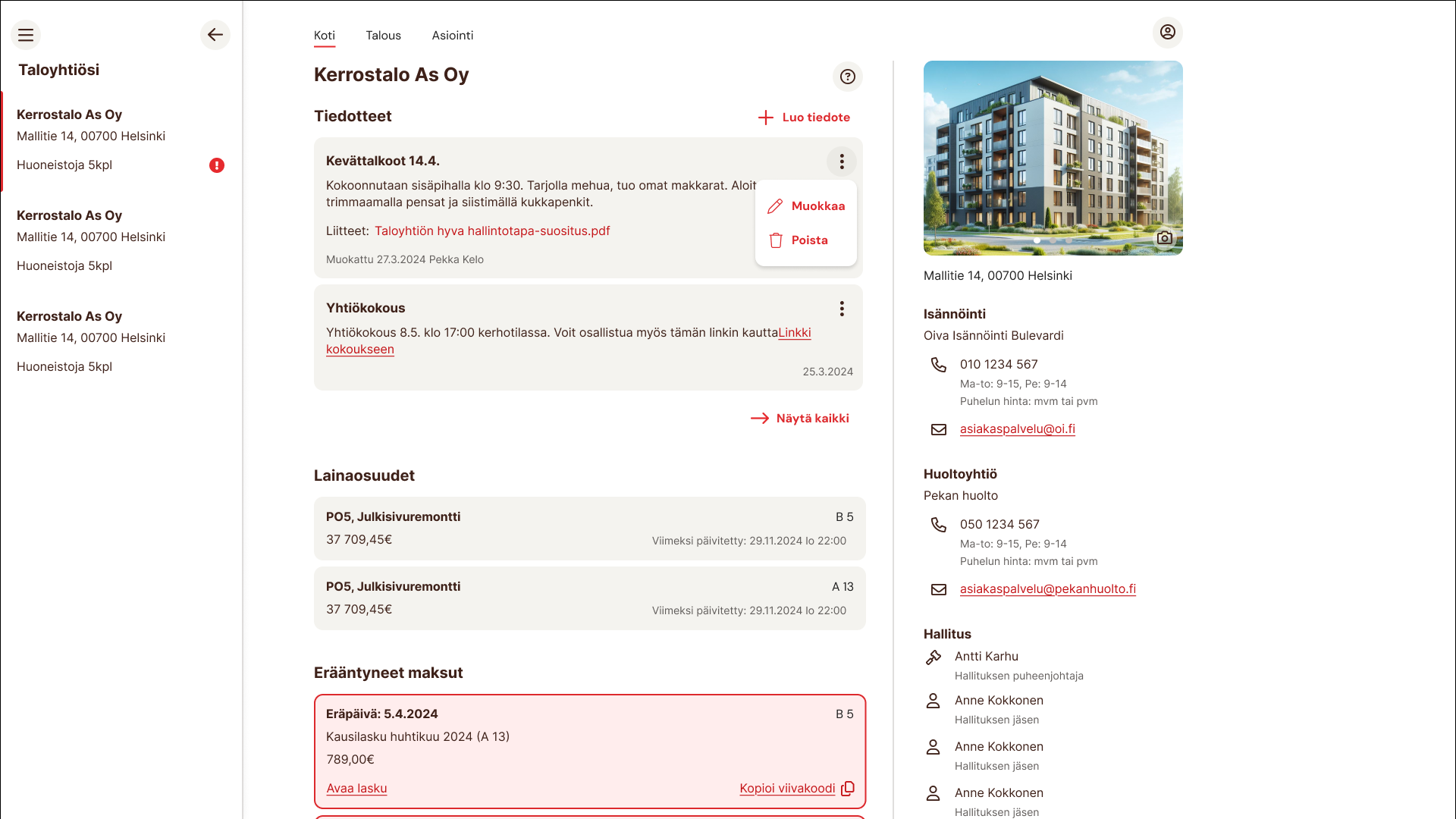
Transparent living
#B2C
#OivaIsännöinti
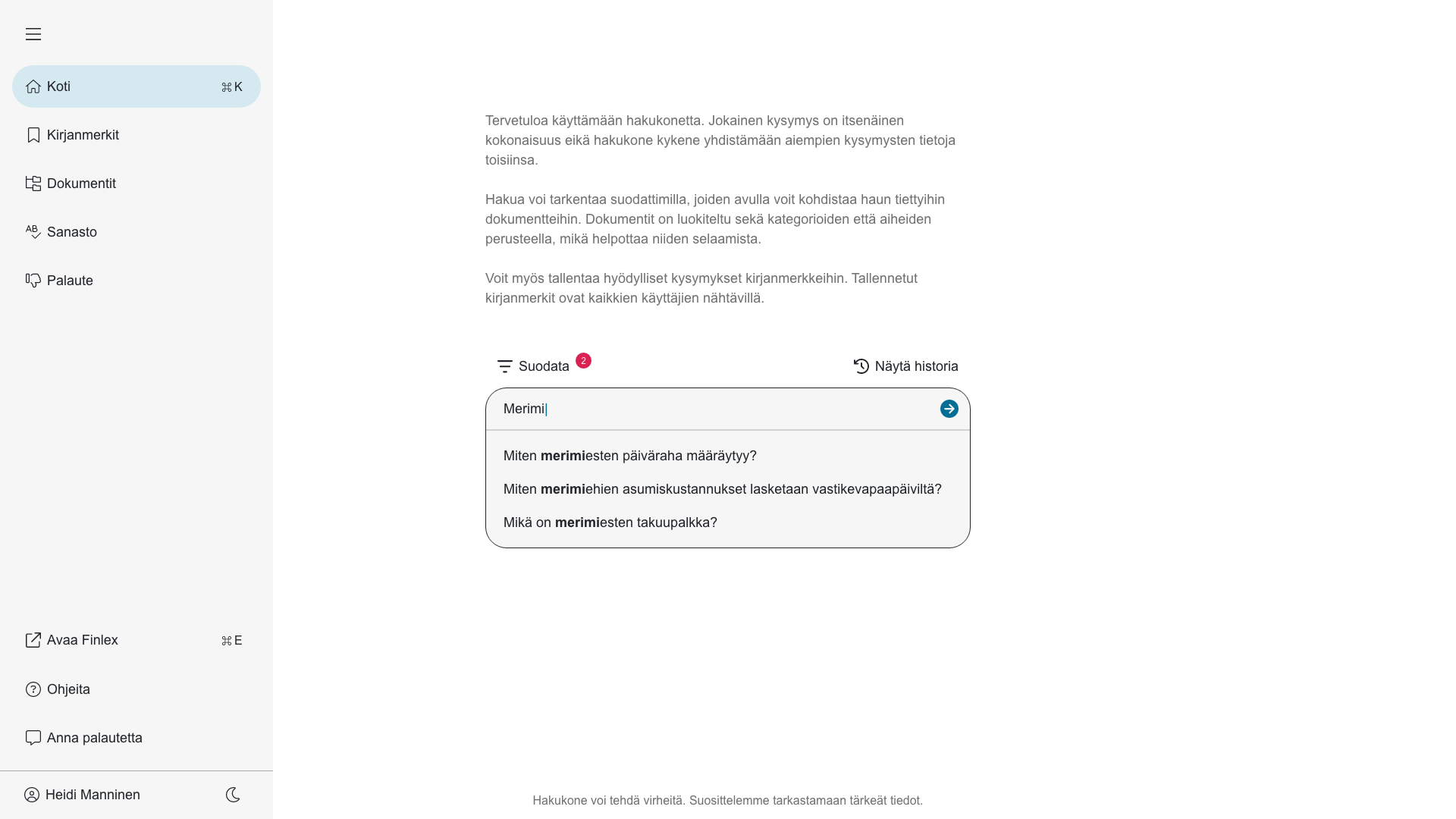
The challenge
Create a digital service that brings housing association data into one clear, easy-to-use app. The goal: improve transparency for residents and save time for property managers.
My role
Research
User flows
Wireframes
UI + Visual design
Style guide
Accessibility
Prototype
Results
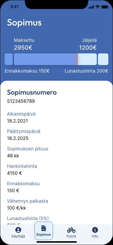
- Apartment owners access financial data, documents, and messaging in one place
- Accessibility focus: large touch targets, high contrast, simple navigation
- My research revealed older than expected user base
- No usability issues reported post-launch
- Oiva gained a competitive edge with transparent, data-driven property management
A calm, accessible app that builds trust, supports aging users, and sets Oiva apart in their industry.
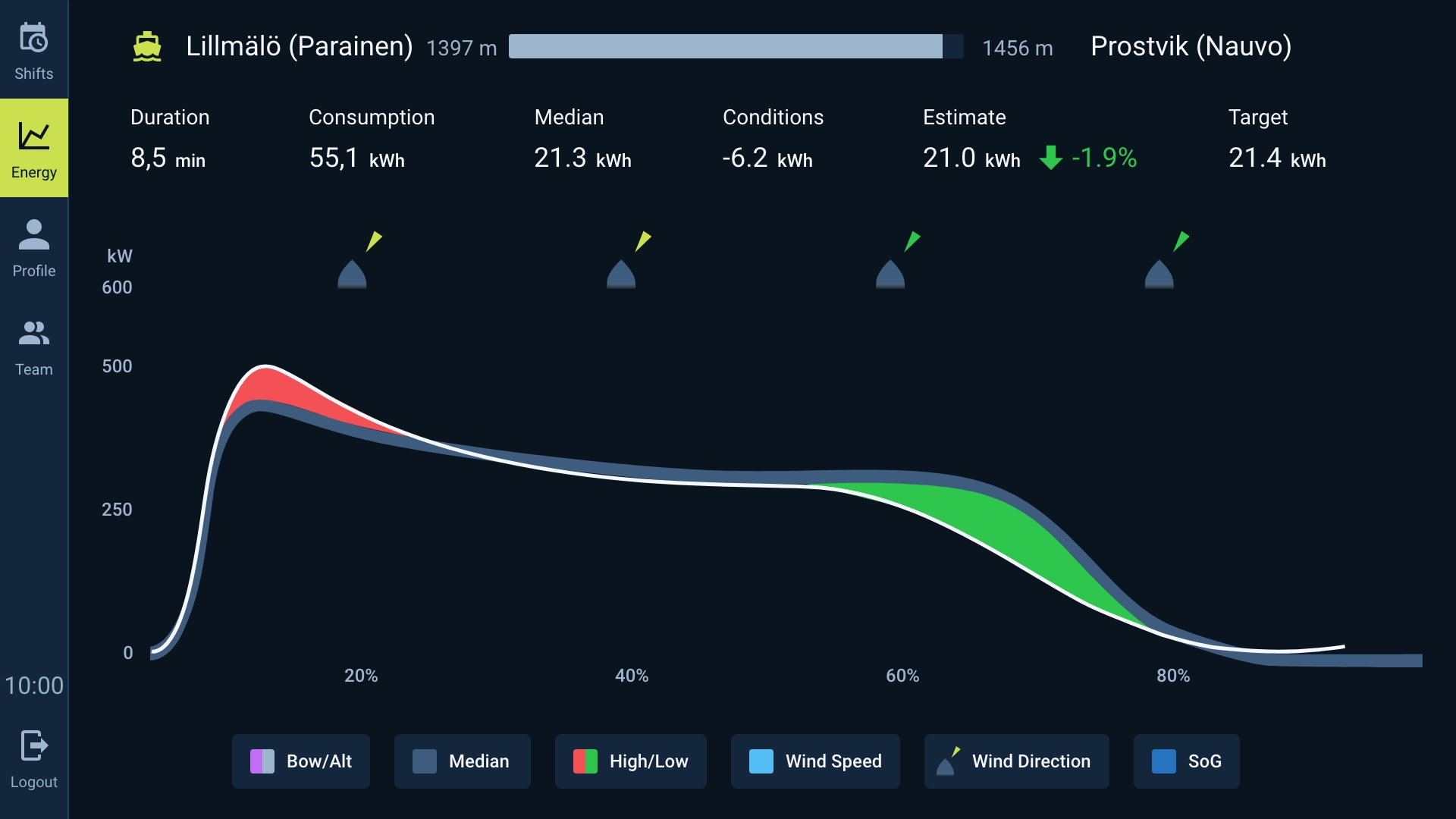
Gamifying Efficiency
#B2B
#Finferries
The challenge
Design a tool that shows ferry captains how to drive more efficiently: when to use power, when to hold back, and how close they are to the AI-calculated optimum.
My role
Research
User flows
Wireframes
UI + Visual design
Accessibility
Prototype
Results
- Emissions and energy use decreased 28%
- Captains learned efficient techniques in real time
- Simple, game-like interface: match your curve to the “perfect” one
- Leaderboards tested, but dropped. Too few captains, morale impact
A serious B2B tool that feels like a game. It’s teaching efficiency, saving money, and cutting emissions.
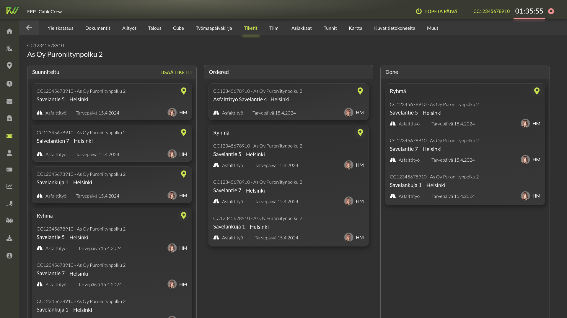
Evergrowing ERP
#B2B
#Cablecrew
The challenge
How do you grow a simple tool for tracking hours and photos into a full ERP platform that covers mapping, documents, budgets, salaries, ticketing, deliveries, and warehouse management, while working with a very small team and limited resources? The system also needed to support the company as it scaled rapidly, ensuring that new processes and a larger workforce could still run smoothly.
My role
User interviews
User flows & wireframes
UI & visual design
Style guide
Accessibility
Prototype
Feedback survey
Results
- The ERP grew into a versatile platform that adapts to different user types and devices
- The system enabled the company to scale its operations significantly while keeping processes efficient and manageable
- Survey feedback showed high usability, with some room for more polish in quality and coherence
- A long backlog of feature requests reflects both strong adoption and ongoing business growth
Built by a tiny team, this ERP became the backbone that allowed the company to grow far beyond its original size.
Setting Expectations
#B2B
#B2C
#ProUnemploymentFund
The challenge
Design two AI-powered bots: one to help staff process customer forms and one to guide the public on the website. Both needed to deliver quick, reliable answers, but with technical limits on freeform conversation the UI had to set clear expectations and build trust.
My role
Research
User interviews
User flows & wireframes
UI & visual design
Style guide
Accessibility
Prototype
Results
- Two tailored bots: search-like interface for staff and chat-style for the public
- Early feedback from users and client is positive
- Design insights gained on expectation-setting, trust, and the role of copywriting in chatbot UX
By setting realistic expectations and focusing on trust, the AI chatbots open a path toward better digital support for both citizens and employees.
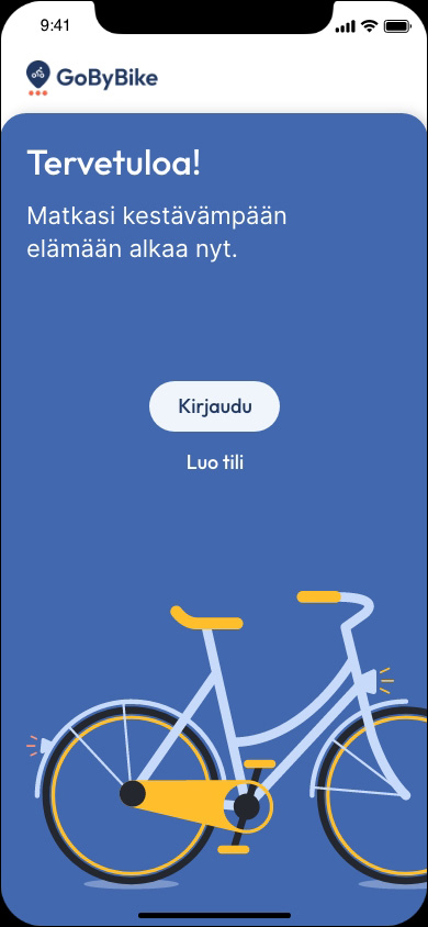
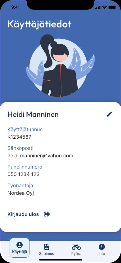
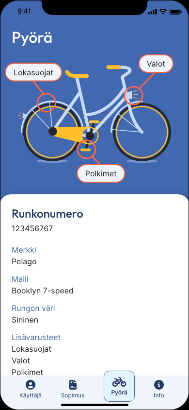
Easy Riding
#B2C
#GoByBike
Design brief
Create a digital service that streamlines the leasing experience:
- Easy access to contracts, schedules, and bike specs
- Renewal reminders, support, and forms for different scenarios
- Insights for the leasing company and partner shops
- Tools for employers to track benefit usage among staff
The app should feel approachable, sympathetic, and easy to use.
My role
Research
Consept design
The consept
- Visual style based on the company’s brand: large text, vector images, vibrant colors
- Adjustments for accessibility and readability
- Dark blue backgrounds for depth, with white boxes for clarity
- Rounded shapes to add friendliness and approachability
- Potential use of subtle animations to enhance engagement
Next steps
This concept establishes a foundation for a welcoming, accessible leasing platform. With refinement and testing, it could evolve into a service that strengthens the company’s brand while making bike leasing easier for everyone.
2D and 3D
#B2C
#3DModelling
#GraphicDesign
Most of my working life I have done all kind of visual designs. From industrial and advertising 3D modelling to editing videos and websites. In all of them I have managed the planning and production myself.
My role
3D modelling
Graphic design
3D modelling
As a digital artist in Fake Production, I did advertisement to big companies in Finland and abroad. My responsibilities were composition, design, lighting, modelling, texturing and rendering.

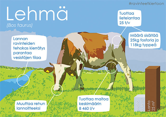
Graphic design
As a graphic designer, I have created brochures, advertisements, infographics and websites. I particularly like the challenges of visualising information. Converting text and numerical data into images makes the information much easier to understand. At the same time, the final product serves as a visually appealing and memorable image.