Transparent living
#B2C
#OivaIsännöinti
In this project, we created a digital service for a house managing agency that brings together all key information about housing associations, like real-time financial data and important documents, into one easy-to-use app. I worked as the UI/UX Designer, responsible for making sure the app was simple, clear, and accessible for all types of users.
Product: MyOiva
Team
Designer
Project manager
Developer
My contribution
Research
User flows
Wireframes
UI + Visual design
Style guide
Accessibility
Prototype
Who are the users?
MyOiva was built for three key user groups: property managers, housing association board members, and apartment owners. Among apartment owners, we also had to consider those with one property and those managing several.
Each group had different needs and challenges around sharing and accessing information. Property managers were responsible for collecting large amounts of data, but had no easy way to share it with their customers. Board members often lacked access to the latest documents and financial figures. Apartment owners, in turn, had to rely on phone calls or emails to reach property managers or maintenance services.
One important insight was that the average age of the apartment owners is 60. This meant that the interface had to be especially simple, intuitive, and meet accessibility standards to ensure everyone could use it comfortably.
Business and Project Goals
MyOiva is part of property management companies wider effort to modernise and digitise their operations. The app should give Oiva house managing agency a competitive edge by making the activities and financial data more transparent. It should also reduces the workload for property managers, since almost everything will be documented in SharePoint and shown in MyOiva automatically. In short, the app brings more value to customers while saving time for the company’s own team.
Research
To understand the market, I researched similar services and built a feature table for the client. I also suggested new ideas, like tools for waste management planning. For visual inspiration, I looked at Airbnb. It’s known for its clean, user-friendly design. Also its housing theme helped guide MyOiva’s look and feel.
While researching I digged in to statistics of Finnish housing, because I wanted to learn more about my users. I discovered that apartment owners in Finland tend to be older than we expected. I shared this info with the client. When they checked their own data, they found the average customer age was indeed 60. The client was very surprised about this fact. This insight didn’t only shape the app, it also led Oiva to change their web design to better reflect and serve their actual target audience while updating their public website.
This lead me to do researched the design principles for elderly users. It helped me focus on clarity, contrast, large touch areas, and predictable navigation more than ever. The goal was to remove friction at every step and make sure the app truly worked for everyone.
Design strategy and explorations
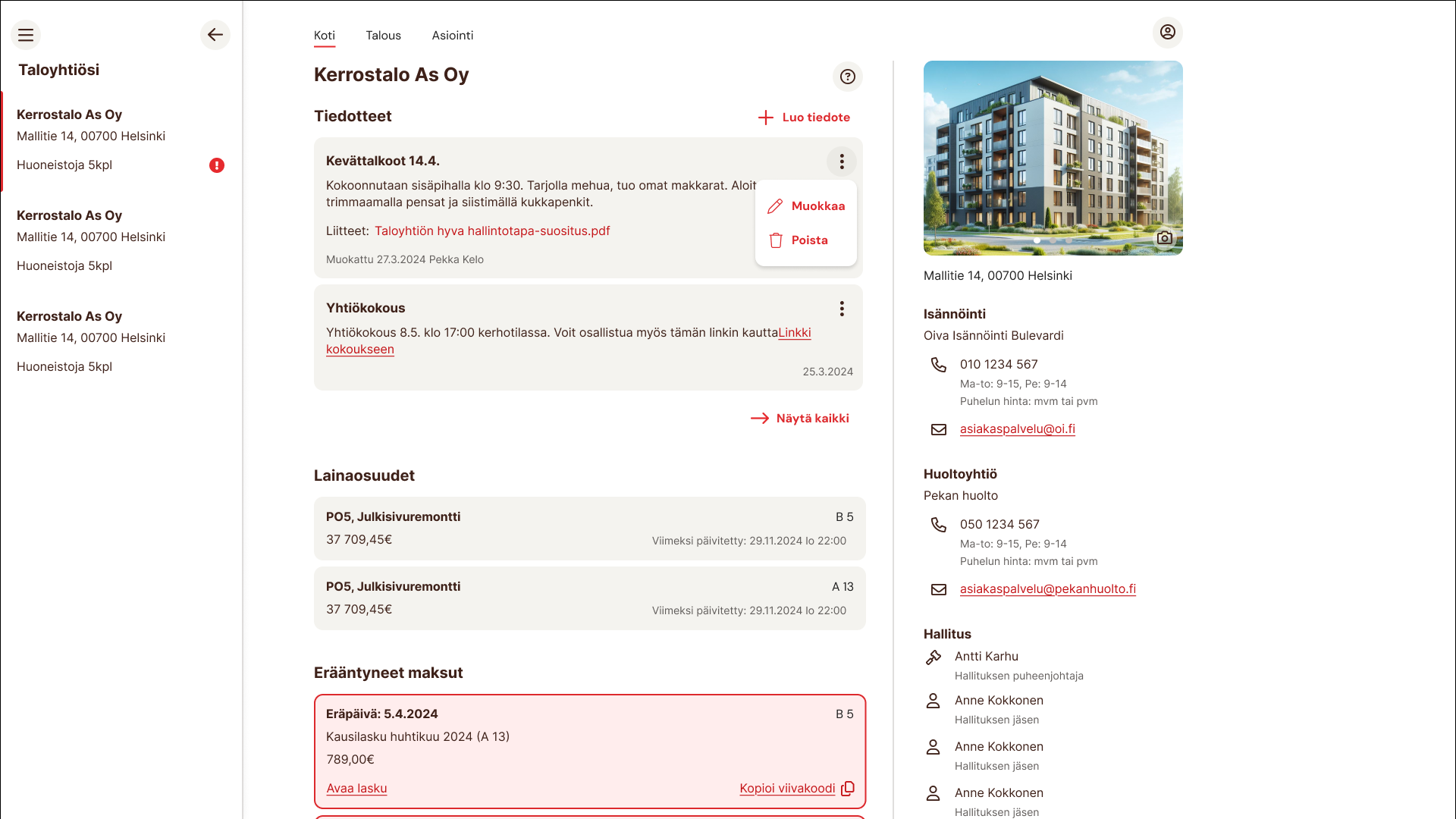
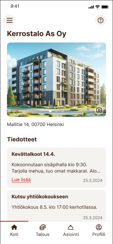
I started the design phase by identifying the core features the app should offer. What information should users see? What actions should they be able to take? We decided to include features like announcements, payment status of management charge, timetable for housing association meetings, financial information of housing association, forms for service requests etc.
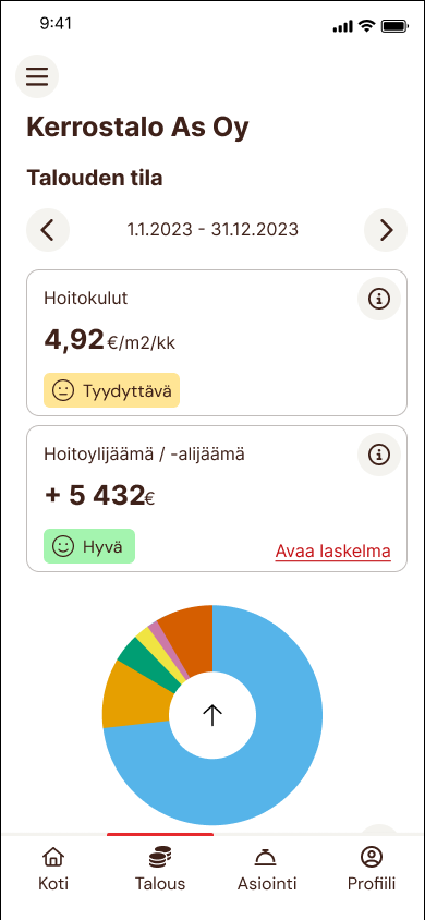
One feature idea I explored was a simple “financial health score” to give users a quick overview. But defining one fair and consistent metric proved too complex, even for the client. After some exploration, we decided to settle for couple of KPIs we could produce.
Navigation and visual design
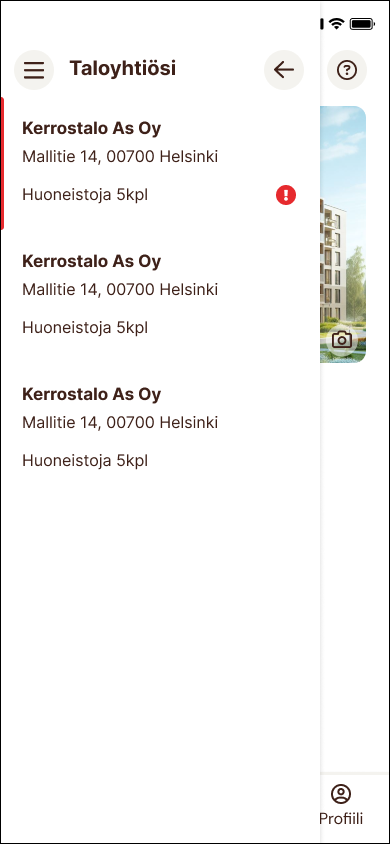
After agreeing on the essentials with the client, I moved on to figuring out the layout and navigation. This turned out to be more complex than expected. Some users had access to several housing companies, so the app had to clearly show which company’s data they were viewing, and make switching between them easy and intuitive.
Navigation was one of my key challenges, especially for users who manage several housing companies. I ended up creating two levels of menus. On large screens, the internal menu for one company is shown at the top; on mobile, it’s placed at the bottom. Switching between companies happens through a side menu that opens from the top left corner. If a user has access to only one company, this menu stays hidden to keep the interface clean.
MyOiva includes a lot of detailed data, documents and forms, and I had to find a layout that worked on both large and small screens. I decided to mostly use full-screen dialogs for housing company subpages to prevent navigation to go too deep. This way, the user never gets lost in the app's structure, and the content stays easy to follow. I also limited dialogs to one level deep, keeping the experience smooth and predictable.
For the visual style, I used Airbnb as inspiration. It’s widely approved as a well-designed app, and its clear, spacious layout felt like a good fit for our audience. While MyOiva follows Oiva’s brand guidelines, I borrowed Airbnb’s use of list styles and icons to help structure content. At first, I added icons to each income and expense category, but later had to scrap that idea. There were simply too many categories, and not enough distinctive or meaningful icons to match each one without creating visual clutter.
During the project, Oiva also redesigned their public website, which meant some adjustments to the app’s style. I updated MyOiva’s color palette and button styles to match the new brand look.
Final solution
The final design is calm, clear and easy to use. Key views are designed to reduce clutter and help users focus on what matters. High contrast between elements and backgrounds supports older users who may have vision difficulties. I used a small set of highlight colors to create hierarchy and call attention to important content, like a payment reminder card that includes both a colored background and a bold border to make sure it's noticed even by users with color vision deficiencies.
Now, users can easily check their housing association’s financial situation, browse documents, and manage communication - all in one place. The structure makes sense across all devices, and the interface stays intuitive no matter the user’s age or technical skill. The end result is a product that fits seamlessly into the everyday life of residents, board members and property managers alike.
Feedback
Throughout the project, the client was very happy with the design direction and the way I approached the challenges. Most changes during the development phase were related to the financial data itself, not the layout or usability. After launch, they gathered feedback internally from their staff. The overall response was positive. While some issues with data accuracy still came up, no one had complaints about the UI or usability. That silence speaks volumes, it tells us that the design works. People are finding what they need, and the app supports their tasks without getting in the way.
Impact
MyOiva is part of a broader digital shift in property management, but unlike many back-office tools, it gives apartment owners and board members direct access to important data. This level of visibility is something completely new. Instead of calling or emailing, users can now simply open an app.
For Oiva, it’s a major step toward modern, data-driven operations. Centralising information has improved internal efficiency, while the app offers a competitive edge and boosts customer satisfaction.
Unfortunately, I wasn’t able to stay on the project long enough to get feedback from end users. I would have loved to hear how older adults, in particular, felt about the app. That feedback would have helped validate my design decisions - or reveal new areas for improvement. Still, the early reception from Oiva’s staff has been positive, and no usability issues have been raised, which is a great sign.
Learnings
One lesson from this project was realising that companies sometimes don’t know their users very well. It’s better to do some research of the topic before making final design decisions. By researching homeowner demographics in Finland, I discovered that the average user is much older the client expected. My insight changed the design direction and even led the client to update their web design to better suit their audience.
This was also the first time I really focused on designing for older adults. Even though MyOiva is for all adult users, learning about age-related needs helped me become a better designer. The research I did around accessibility and visual hierarchy will stay with me in future projects.